Imagine driving down a busy street, surrounded by a sea of construction signs and billboards. Suddenly, one logo catches your eye – it’s bold, memorable, and instantly conveys professionalism. That, my friends, is the power of a well-designed construction logos. It’s not just a pretty picture; it’s the face of your building business, the silent ambassador that speaks volumes about your company’s values and expertise.
In today’s competitive construction industry, branding isn’t just for big corporations anymore. It’s become an essential tool for businesses of all sizes to stand out from the crowd and build trust with potential clients. And at the heart of this branding effort? You guessed it – the humble yet mighty construction logo.
Key Takeaways
- A construction logo is a visual representation of your building business that helps create brand recognition and trust.
- Effective logos combine industry-specific elements with unique design features to stand out from competitors.
- Your logo should reflect your company’s values, services, and target audience.
- A well-designed logo can be used across various marketing materials, from business cards to vehicle wraps.
The Blueprint of a Powerful Construction Logo
So, what exactly makes a construction logo tick? It’s not rocket science, but it does require a bit of creative thinking and strategy. Let’s break it down, shall we?
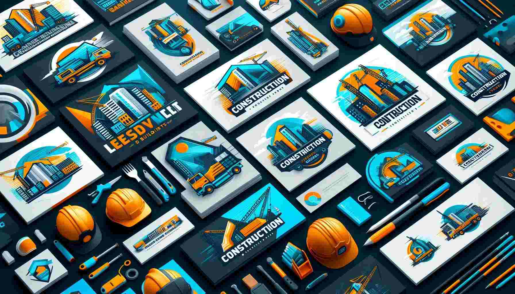
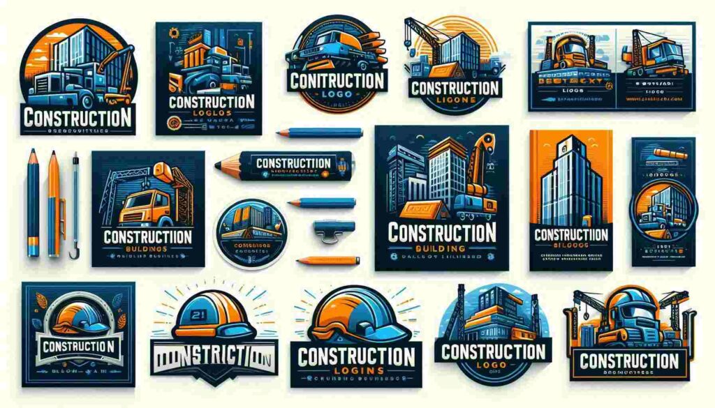
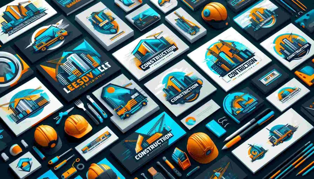
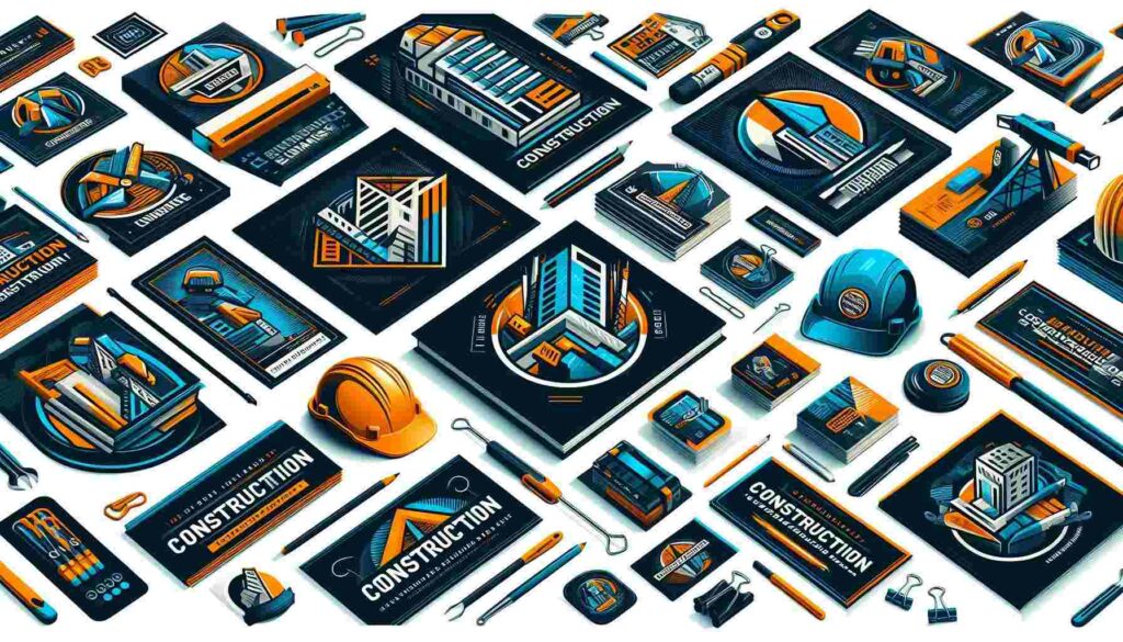
First things first, your logo should scream “construction” without saying a word. Think about incorporating elements that are instantly recognizable in the industry – things like hard hats, tools, or building silhouettes. But here’s the catch: you don’t want to be too obvious or cliché. The key is to find a unique twist that sets you apart from the sea of generic logos out there.
For example, instead of slapping a generic hammer icon on your logo, why not create a stylized version that doubles as the first letter of your company name? Or consider using negative space to create the illusion of a building within your logo design. The possibilities are endless, and that’s where the fun begins!
Now, let’s talk color. In the construction world, you’ll often see a lot of yellows, blacks, and oranges – colors associated with caution signs and heavy machinery. While these can be effective, don’t be afraid to think outside the box. A splash of unexpected color could be just what you need to catch someone’s eye.
Remember, though, that your color choice should still align with your brand personality. Are you a modern, eco-friendly construction company? Maybe incorporate some greens or blues. Do you specialize in luxury home builds? Rich purples or golds might be more your style.
Typography: The Unsung Hero of Logo Design
Now, let’s give a shout-out to an often overlooked aspect of logo design: typography. The font you choose for your company name can speak volumes about your brand. Are you going for a rugged, industrial feel? A bold, sans-serif font might do the trick. Aiming for a more refined, architectural vibe? A sleek, modern typeface could be just the thing.
But here’s a pro tip: whatever font you choose, make sure it’s legible at various sizes. Your logo might look great on a billboard, but how does it hold up on a business card? Test it out at different scales to ensure it remains clear and impactful.
Versatility: The Name of the Game
Speaking of different scales, let’s talk about versatility. Your construction logo needs to be a jack-of-all-trades, looking equally fantastic on a hard hat, a website, or the side of a truck. This means your design should work well in both color and black-and-white versions.
Consider creating a simplified version of your logo for situations where space is limited. This could be as simple as using just the icon portion of your logo or a more compact arrangement of elements.
And don’t forget about different file formats! You’ll want vector files for scalability, as well as various raster formats for digital use. Trust me, your future self (and your printer) will thank you for being prepared.
Bringing Your Brand Story to Life
Here’s where things get really interesting. Your logo isn’t just a pretty picture – it’s a storytelling tool. It should reflect your company’s values, history, and unique selling points. Are you a family-owned business that’s been around for generations? Maybe incorporate elements that suggest heritage and tradition. Are you known for using cutting-edge technology? Your logo could include modern, sleek elements to reflect this.
For instance, I once worked with a construction company that specialized in eco-friendly builds. We created a logo that cleverly combined a leaf shape with the silhouette of a house, instantly communicating their green approach to construction. It was simple, yet effective – and it became an instant conversation starter at trade shows.
Remember, your logo is often the first point of contact between your business and potential clients. It’s your chance to make a strong first impression and communicate what makes your company special. So don’t be afraid to inject some personality into your design!
As we move forward, we’ll explore some real-world examples of successful construction logos and dive into the nitty-gritty of the design process. But first, let’s take a moment to consider how your logo fits into your overall branding strategy…
Integrating Your Logo into Your Brand Strategy
Now that we’ve got our logo sorted, let’s chat about how it fits into the bigger picture. Your logo is just one piece of the branding puzzle, albeit a pretty important one. It should work harmoniously with your other branding elements – your website, business cards, uniforms, and even the way you answer the phone.
I once worked with a construction company that went all out with their branding. They had their logo embroidered on high-vis vests, printed on coffee mugs, and even created a custom hard hat design for site visits. It might seem like overkill, but let me tell you, it made a lasting impression on clients and competitors alike.
Remember, consistency is key. Your logo should be the thread that ties all your marketing materials together. Use it consistently across all platforms, but don’t be afraid to get creative with its application. Maybe your logo could be subtly incorporated into the layout of your website, or used as a watermark on project photos.
Here are some ideas to get your creative juices flowing:
- Create a branded email signature with your logo
- Design custom vehicle wraps featuring your logo
- Use your logo as a watermark on project photos on social media
- Incorporate your logo into safety signage on construction sites
- Create branded merchandise like pens, notepads, or even miniature hard hats
The DIY Approach vs. Professional Design
Now, I know what some of you might be thinking. “Can’t I just whip up a logo myself and call it a day?” Well, sure you can. There are plenty of online logo makers out there that can help you create something basic. But here’s the thing – your logo is an investment in your business’s future. It’s worth considering professional help.
A professional designer brings more than just artistic skills to the table. They understand the psychology of color, the nuances of typography, and how to create a design that will resonate with your target audience. Plus, they can provide you with all the file formats you’ll need for different applications.
That being said, if you’re just starting out and budget is tight, there’s no shame in creating a simple logo to get you going. Just keep in mind that you might want to revisit it as your business grows and evolves.
Evolving Your Logo Over Time
Speaking of evolution, let’s talk about logo updates. Your initial logo might serve you well for years, but there may come a time when it needs a refresh. Maybe your services have expanded, or perhaps your original design is starting to look a bit dated.
Take Caterpillar, for example. Their iconic logo has undergone several subtle updates since its inception in the 1920s. Each change has modernized the design while maintaining the core elements that make it instantly recognizable.
If you do decide to update your logo, tread carefully. You don’t want to lose the brand recognition you’ve built up over the years. Consider an evolution rather than a revolution – subtle tweaks that bring your logo up to date while maintaining its essence.
The Power of a Well-Designed Construction Logo
At the end of the day, a great construction logo is more than just a pretty design. It’s a powerful tool that can help you build trust, attract clients, and stand out in a crowded market. It’s the face of your brand, the first impression you make on potential clients, and a visual shorthand for everything your company stands for.
So whether you’re starting from scratch or thinking about a redesign, take the time to get it right. Your logo is an investment in your business’s future, and when done well, it can pay dividends for years to come.
Remember, in the world of construction, you’re not just building structures – you’re building a brand. And your logo? Well, that’s the foundation it all rests on. So make it strong, make it memorable, and most importantly, make it yours.
Frequently Asked Questions
1. What elements should I include in my construction logo?
Your construction logo should ideally include elements that are instantly recognizable in the industry, such as hard hats, tools, or building silhouettes. However, try to incorporate these in a unique way to stand out. Also, consider including your company name and a tagline if you have one. Remember, simplicity is key – don’t overcrowd your logo with too many elements.
2. How do I choose the right colors for my construction logo?
While yellows, blacks, and oranges are common in construction logos due to their association with caution signs and machinery, don’t be afraid to think outside the box. Choose colors that align with your brand personality. For example, if you’re an eco-friendly construction company, you might opt for greens or blues. Always ensure your color choices work well in both color and black-and-white versions of your logo.
3. Should I design my own logo or hire a professional?
While it’s possible to design your own logo using online tools, hiring a professional designer can be a worthwhile investment. Professional designers bring expertise in color psychology, typography, and creating designs that resonate with target audiences. They can also provide you with all the necessary file formats for different applications. However, if budget is tight, creating a simple logo yourself to start with is better than having no logo at all.
4. How often should I update my construction logo?
There’s no set rule for how often you should update your logo. Many successful companies maintain the same logo for decades with only minor tweaks. However, you might consider an update if your logo looks dated, if your services have significantly expanded, or if you’re rebranding. When updating, aim for evolution rather than revolution to maintain brand recognition.
5. What file formats do I need for my construction logo?
You’ll need your logo in various formats for different uses. Vector files (like .ai or .eps) are essential for scalability without loss of quality. You’ll also need raster formats like .jpg and .png for digital use. It’s helpful to have your logo in both color and black-and-white versions, as well as versions with and without backgrounds.
6. How can I ensure my construction logo is versatile?
To ensure versatility, your logo should look good at various sizes – from a small business card to a large billboard. It should work well in both color and black-and-white. Consider creating a simplified version for situations where space is limited. Test your logo on different backgrounds and in various applications (like embroidery or vehicle wraps) to ensure it’s truly versatile.
7. Can I trademark my construction logo?
Yes, you can trademark your logo to protect it from being used by others. This is especially important if your logo is a key part of your brand identity. The process involves filing an application with the United States Patent and Trademark Office. It’s often helpful to consult with a trademark attorney to navigate this process.
8. How do I integrate my logo into my overall branding strategy?
Your logo should be consistently used across all your marketing materials and touchpoints. This includes your website, business cards, uniforms, vehicle wraps, social media profiles, and even email signatures. Consider creative ways to incorporate your logo, such as using it as a watermark on project photos or integrating it into the design of your website.
9. What makes a construction logo memorable?
A memorable construction logo is often simple, unique, and relevant to the industry. It should be easily recognizable even at a glance. Incorporate elements that tell your brand story or highlight what makes your company unique. Avoid overly complicated designs or following current trends too closely, as these can quickly become dated.
10. How much should I expect to pay for a professional logo design?
The cost of professional logo design can vary widely depending on the designer’s experience, the complexity of the design, and the number of revisions included. You might pay anywhere from a few hundred dollars for a basic design to several thousand for a comprehensive branding package from a high-end agency. Remember, your logo is an investment in your brand, so it’s worth allocating a reasonable budget to get it right.